Session Organizer
Objective
Simplify our learning platform by giving teachers what they need, when they need it. That meant building analytics and insights directly into the experience so teachers don't have to hunt them down. That meant, quite simply, making planning easy.Purpose
Our current platform was functional but overwhelming. Resources were being overlooked. Teachers didn't have a clear route to plan their day. Often they were using our resources but on a different platform, like Google Classroom, losing us user retention.Outcome
User testing and feedback showed an overwhelming preference for our new approach, some teachers claiming it was a gamechanging experience.An Unorganized Organizer
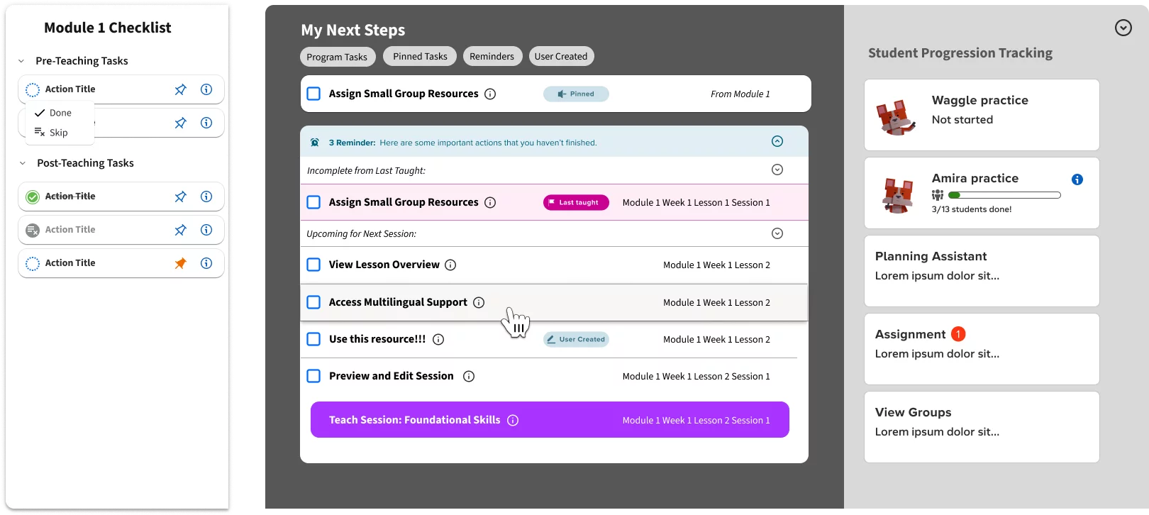
The session organizer is a tool for teachers to help plan their day. It gives them their core lesson material along with helpful resources to put together all they need for a typical classroom session. Unless, that is, they have no idea how to use it. That was the problem we were having with the v1 of the session organizer tool. It was giving teachers too much without clear guidance on how to navigate all the material we were providing them, often leaving the act of organizing to the user rather than doing it for them.
Understanding the Problem Space
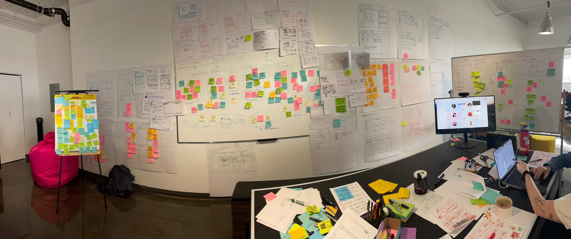
This project started with the first in-person workshop I had attended since before the pandemic. We gathered in our Montreal office and started looking at the problem from scratch. We thoroughly analyzed the problem space, getting into our teachers' heads by going through their day to day, including after hours planning and assessment, and how it fit into our entire product ecosystem. We wireframed, we affinitized feature ideas, we storyboarded. It was a classic UX project with a week-long, in-person kick off. Really, a dream project.
List of Content to List of Actions
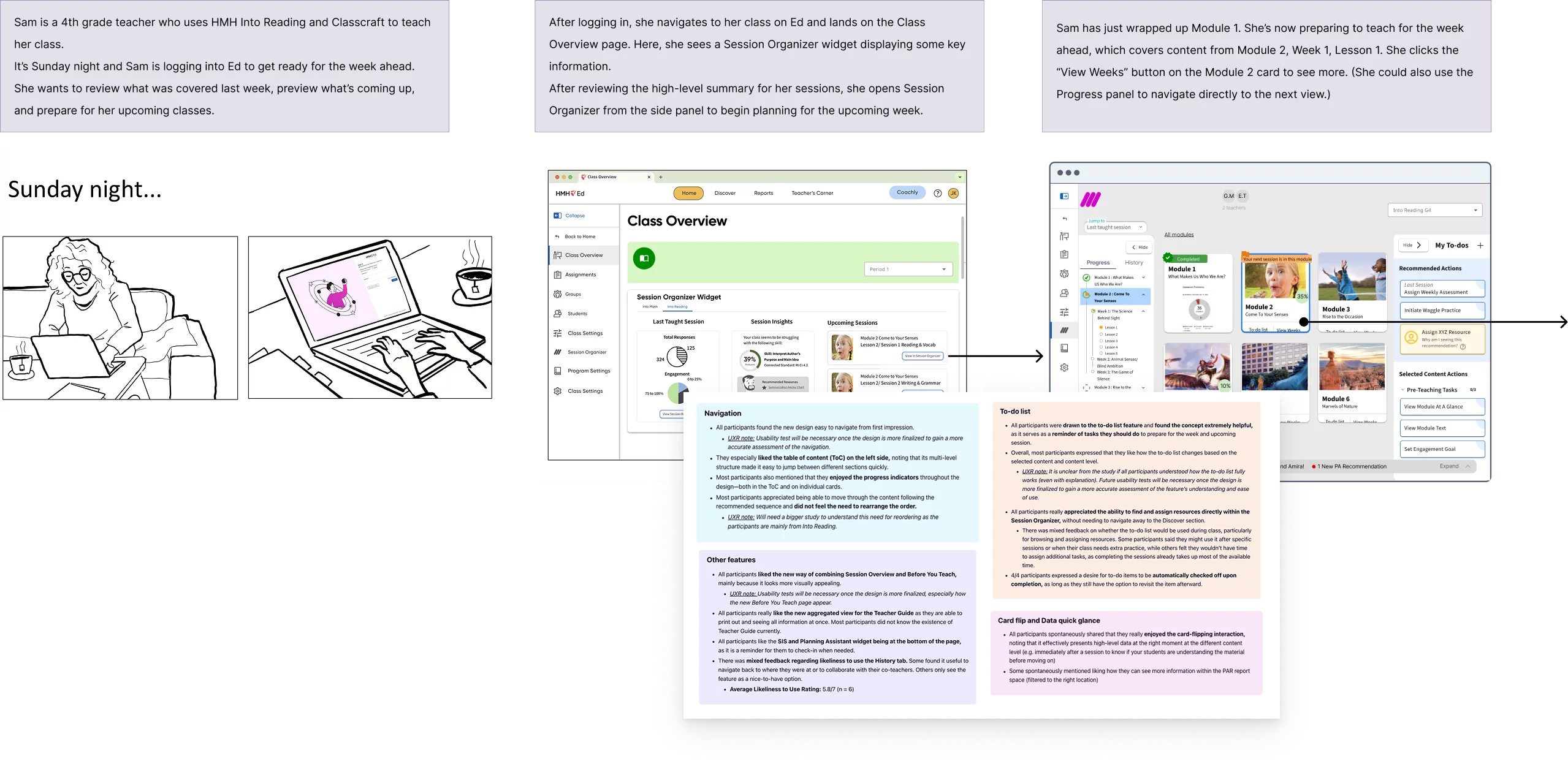
Our breakthrough was realizing that teachers didn't want just a bunch of content that they had to make heads or tails of themselves. Many, especially new teachers, wanted a list of actions that guided them through that content, step by step, like a checklist. But others, usually experienced teachers, still demanded that flexibility to break out of the prescribed narrative and customize their lesson plan. We needed a solution that delivered on both while increasing engagement and usability.
Focused Zones
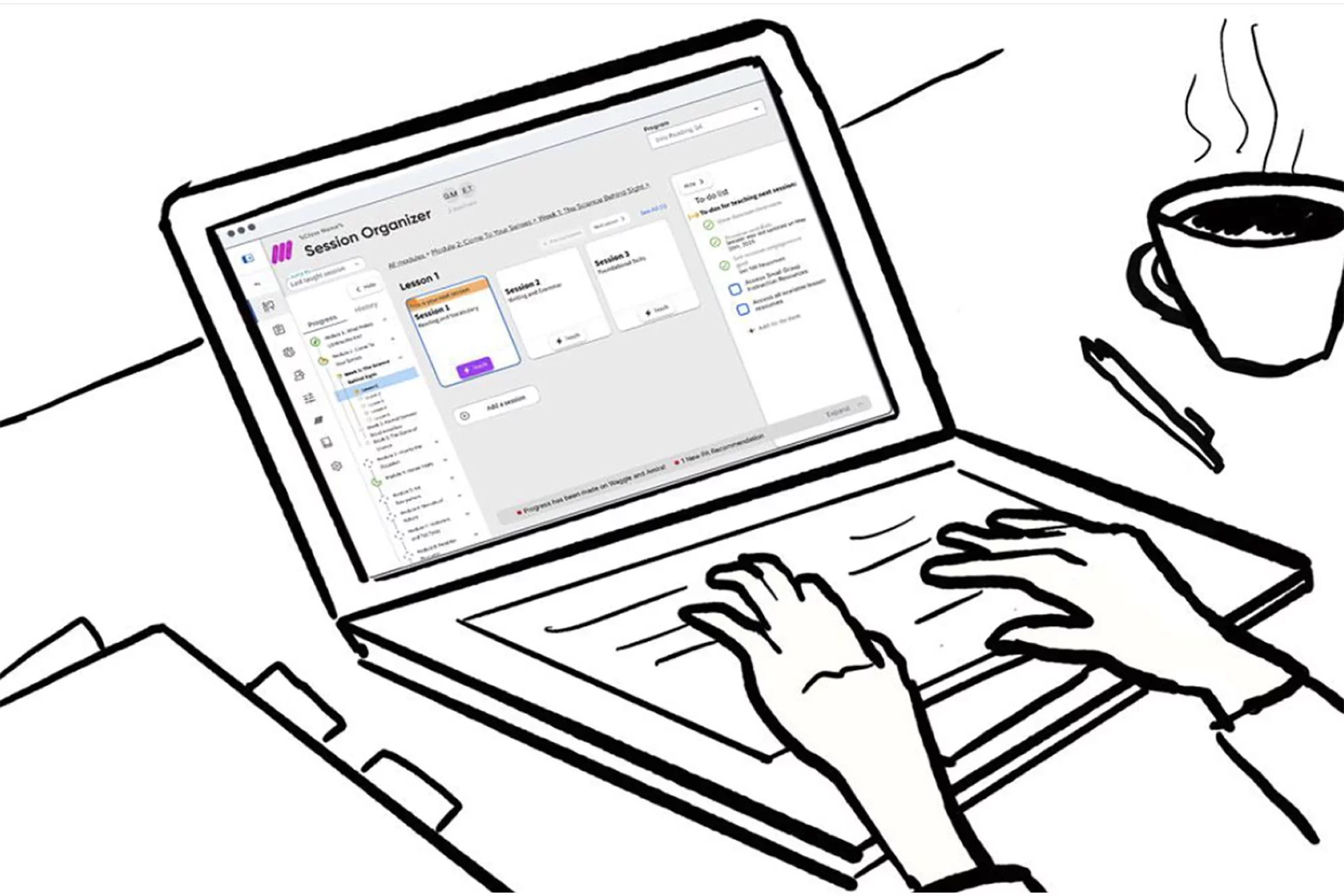
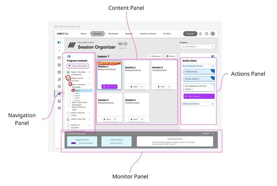
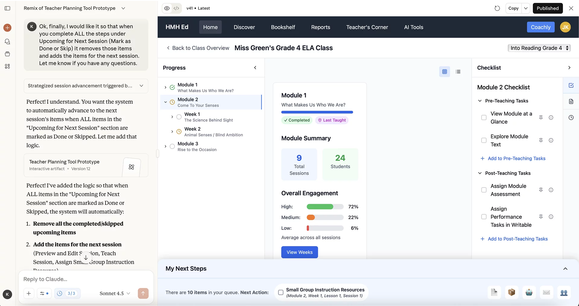
The first thing we did was clean up the interface. We wanted to move from a more utilitarian design into a user-friendly app-based feel. So we made the majority of space devoted to content cards. These allowed us to include helpful visuals at-a-glance metrics on student progression and engagement. Navigation through our content structure would be done by zooming in and out of these content cards. This allowed teachers the flexibility of easily moving through the content as they pleased, something that was difficult to do prior.
Progression
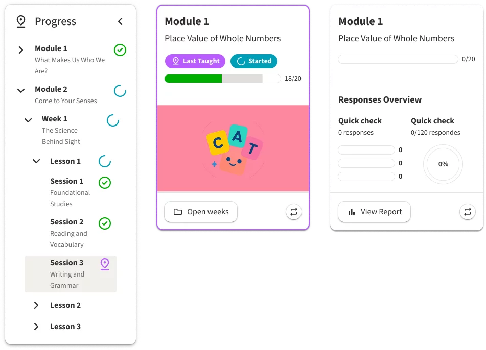
Another key component was giving teachers obvious visual indicators of where they were within the content and how much of the content they had completed. A learning product is a complex system of modules, units, lessons, sessions, resources, etc. It is easy to get lost in the weeds. By providing visual indicators of "Last Taught" as well as completion status not only on the cards but on a useful (and collapsible) side navigation, we always grounded the user in their own progression of the content. This allowed our experienced user to chart their own path, but it was just as easy for them to go right back to where they left off because of the visual reinforcement we provided.
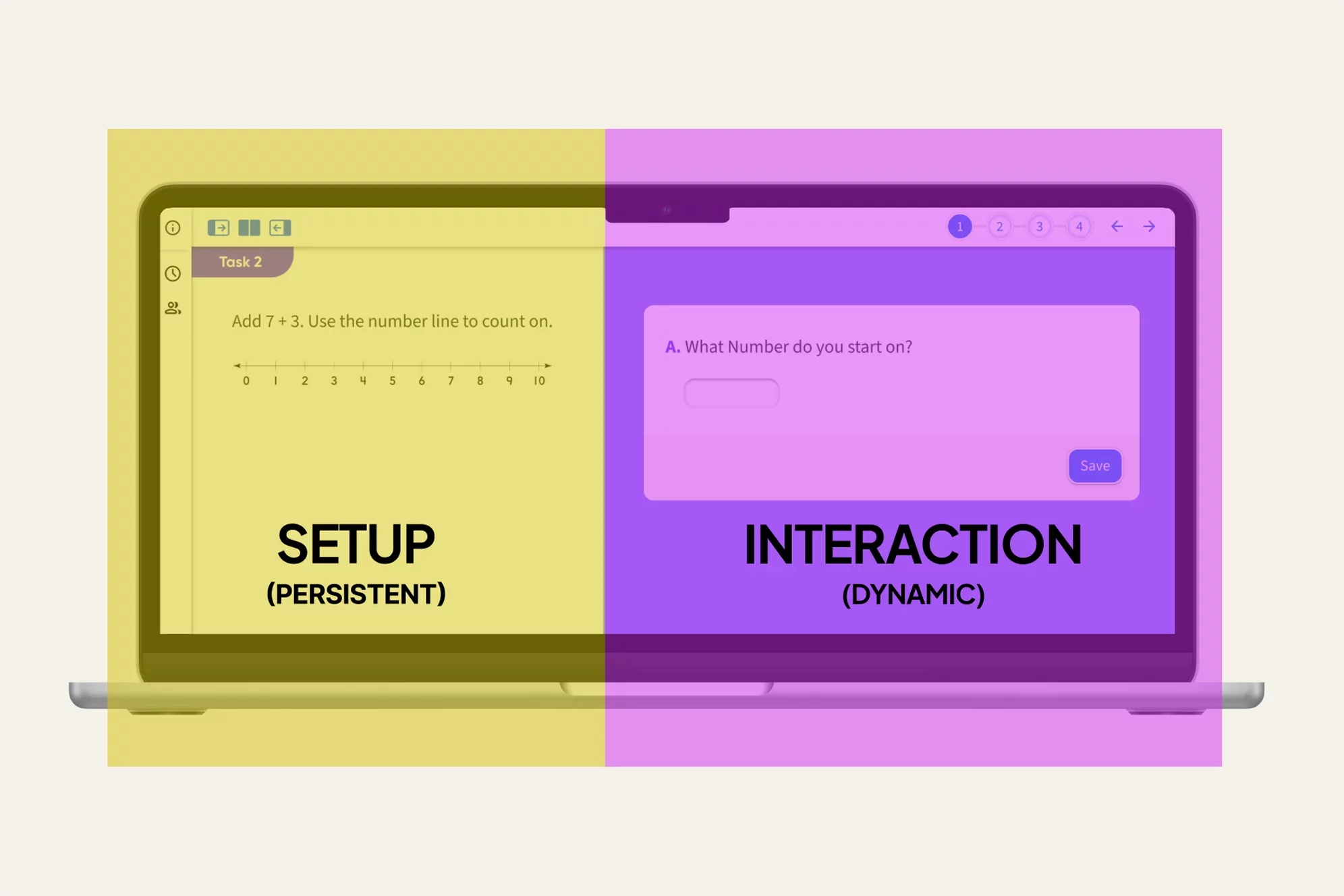
Checklist vs Dynamic List
As previously stated, one major improvement to this version was putting clear actions up front for the user. The first way we did this was by associating a checklist of actions with every piece of content. This provided the specific actions that we felt users should accomplish when interacting with that bit of content, including extra resources that are sometimes buried elsewhere in the platform. This was great for our experienced teachers but new teachers needed an extra helping hand. That's where our command center came in. This provided a collated and sequential list of steps based on the users progression that pulled directly from these content-related actions. If they wanted to teachers could teach their entire class, day after day, week after week, entirely from this Next Step dynamic action list. Even better, it put helpful progression tracking widgets right alongside this queue so they could get helpful guidance on who and what needed extra attention.
AI-Assisted Development
To take all of this from storyboards and wireframes into a testable artifact we decided to try out a new development tool that has since taken over the industry: AI. Figma prototyping can be fairly tedious and clumsy, particularly when conditionals are involved and you want to highlight complex interactions. Prototyping with AI allowed us, with a bit of trial and error, to develop a more robust, feature-rich testing artifact.
Feedback and Next Steps
Testing with actual users yielded overwhelmingly positive feedback. Testers appreciated having everything in one place with a clean, new design. They commented that they found navigation intuitive and much less overwhelming than the original experience. One tester went so far as to say, "This is so visually genius. It's so appealing and I love how it's just all right there on one page. I love it." Still, one major piece to still work on is the placement of the dynamic list within the overall platform as it may be useful outside of the session organizer experience itself, further simplifying the experience in turn.